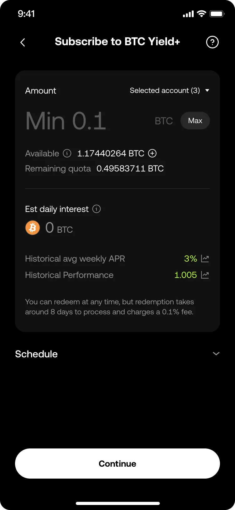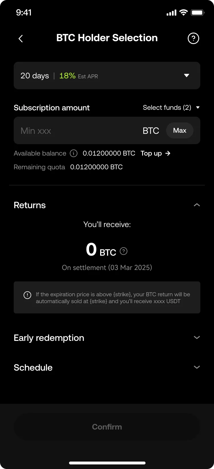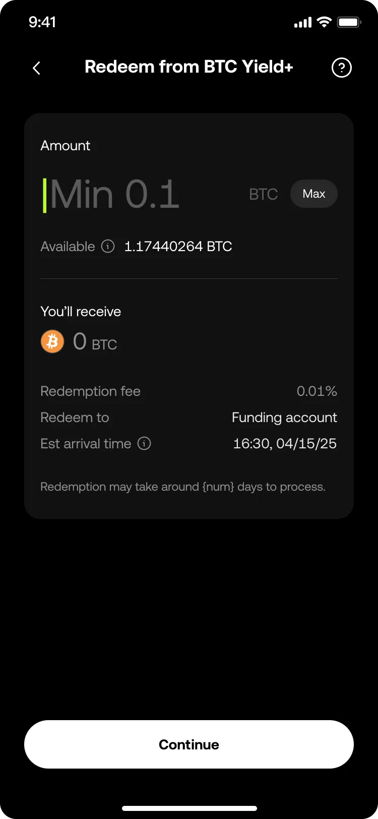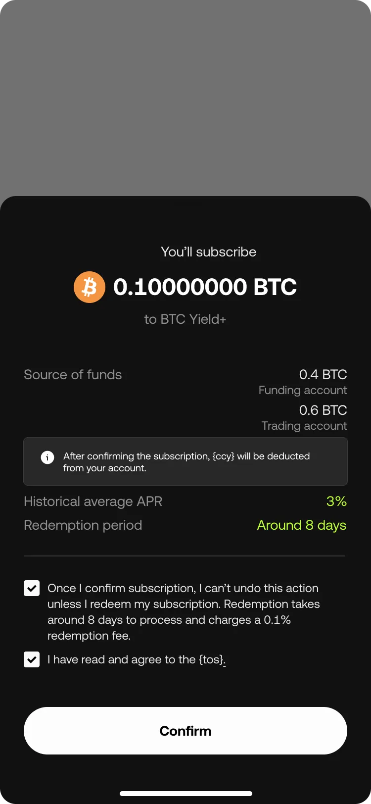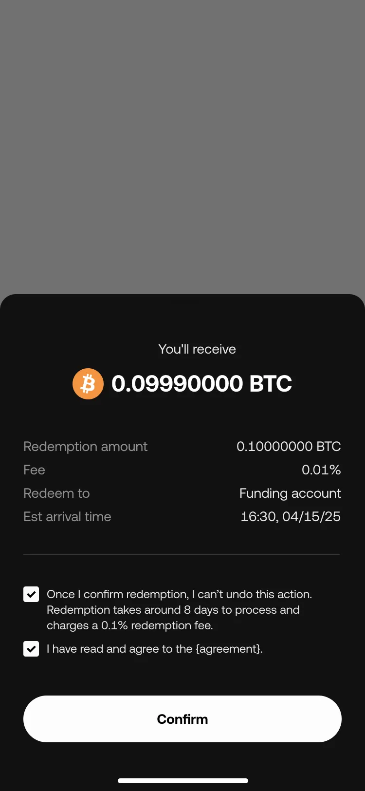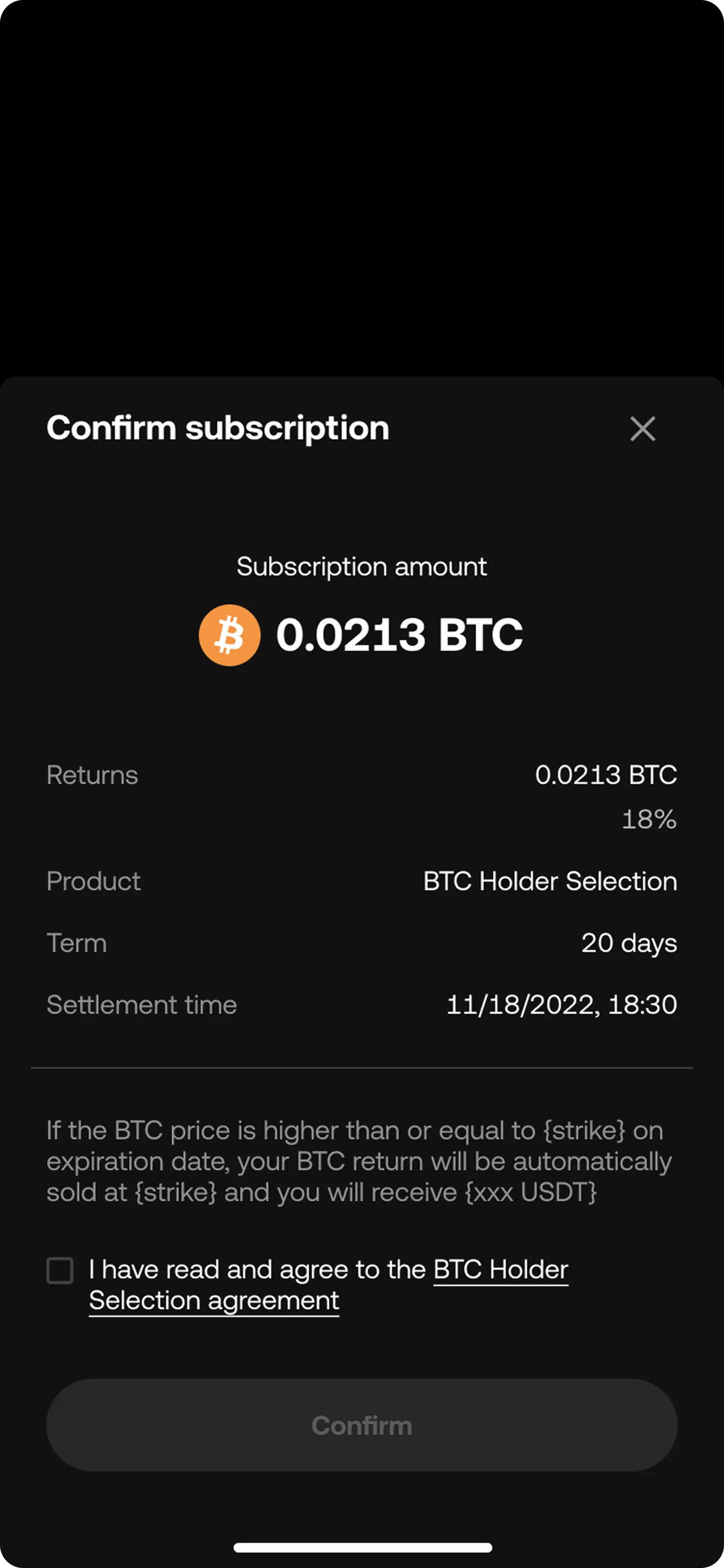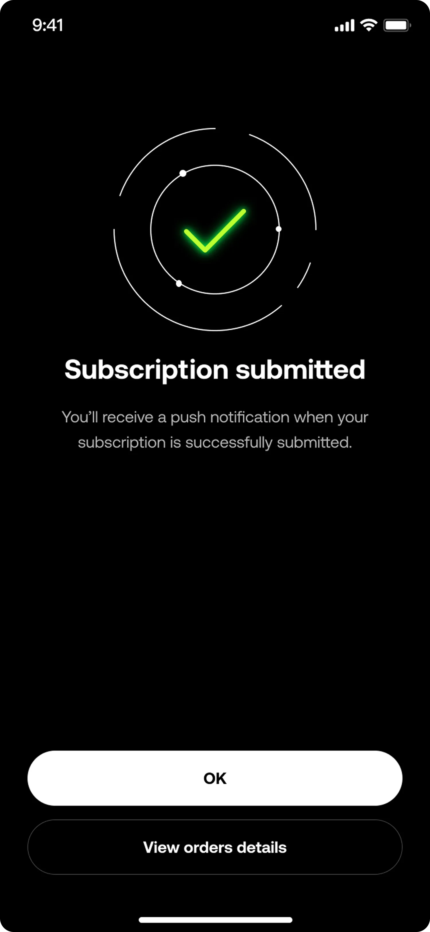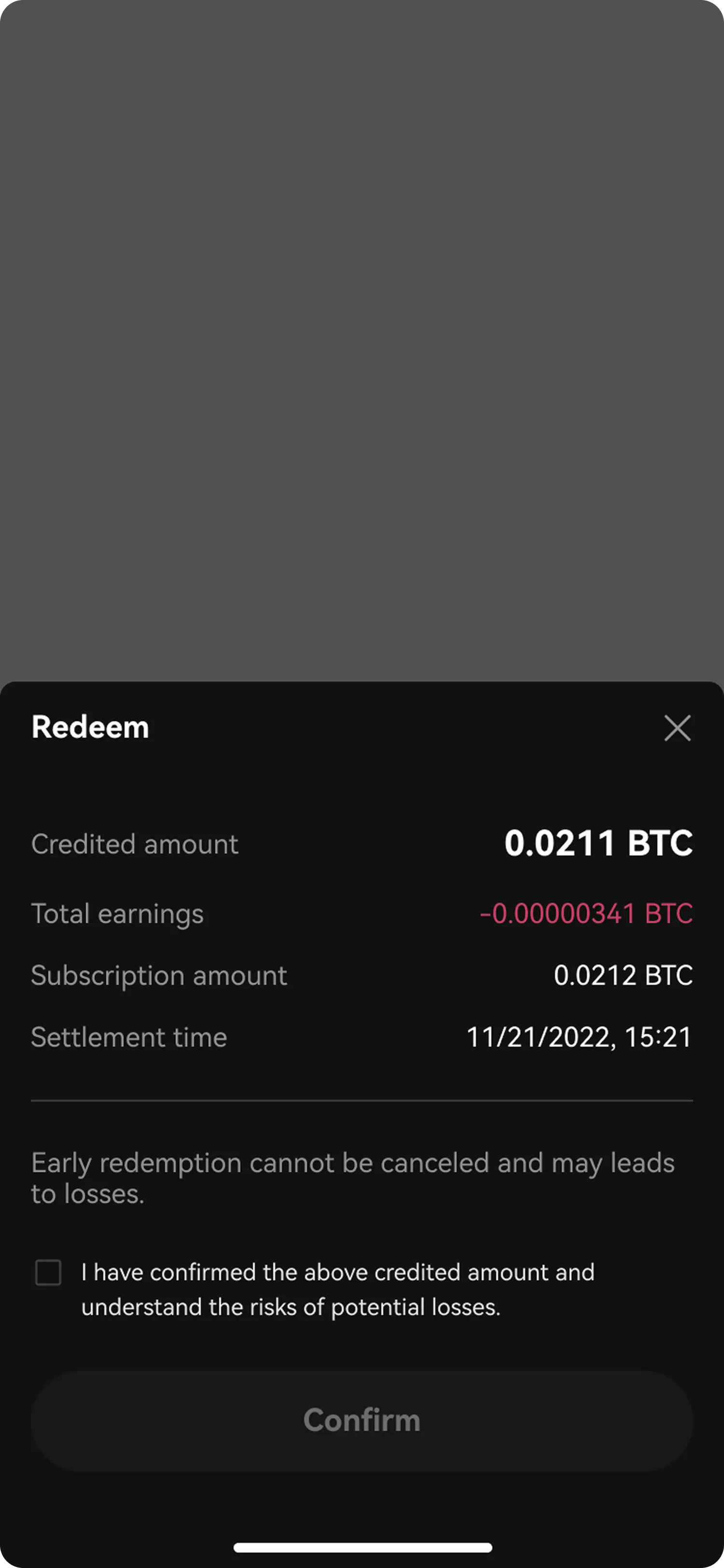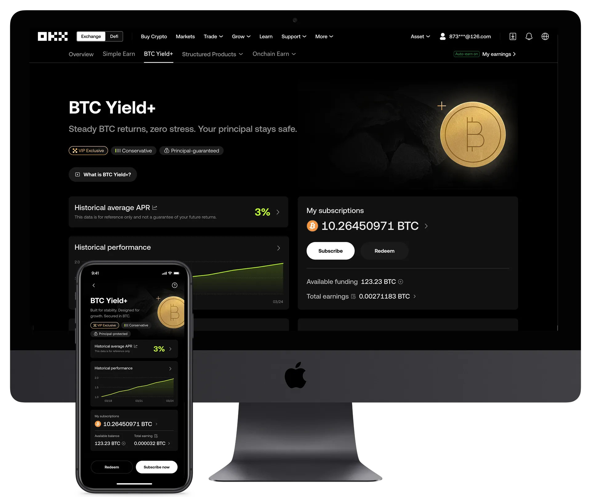
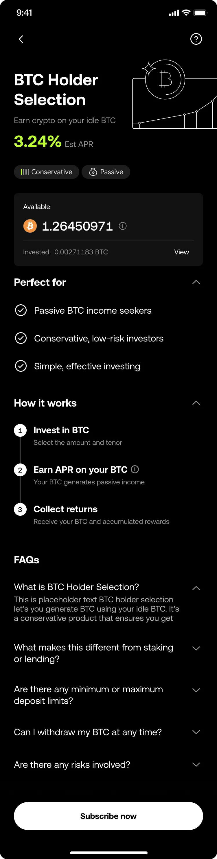
The full landing page scrolls as you move down the page. Drag to compare.
Landing screen
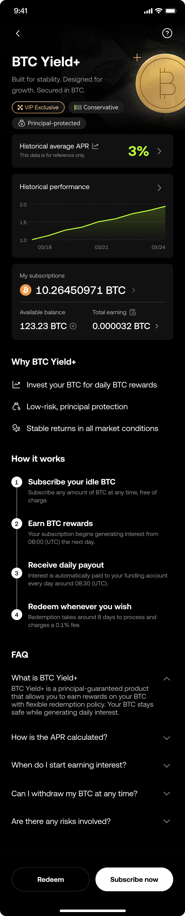
People wanted historical APRs to judge past performance. The redeem button was too hidden, and the copy didn’t make clear what they would earn.
- Added a historical performance card showing past APRs
- Moved redeem into a sticky bottom bar so it is always in reach
- Added My subscriptions with live balance and earnings
- Rewrote the copy around the product, which cut people’s questions